Archive for the 'GNOME themes' Category

24
Jun
09

Several Ubuntu Themes

My readomatic directed me to a post by Anurag Arora, in which he gives detailed instructions on how to install several Ubuntu themes by Francois Vogelweith. Since Mr. Vogelweith himself writes in French, these English-language instructions are invaluable.

There is one spot in the instructions which might confuse the unwary, though. In the line

sudo apt-key adv –recv-keys –keyserver keyserver.ubuntu.com 0×1781bd45c4c3275a34bb6aec6e871c4a881574de

you need two hyphens before the words “recv” and “keyserver” (first occurrence). This isn’t necessarily obvious when reading the small font the line is written in.

These themes are well worth the effort of adding the extra repository. The files are large, but that’s because they contain a lot of extras you often don’t get in a theme download. For example, each theme comes with its own set of icons (though they’re mostly similar except for the colors). They also come with matching desktop backgrounds and GDM (login screen) themes.

I tried a few of these themes before settling on Balanzan (screenshot below):
Balanzan Desktop

Balanzan fits in well with the standard Ubuntu color scheme. That means if you don’t like the icons that come with the theme, it will work well with the default Human icons as well. I haven’t had that problem, but I can tell that the alternate icons may not fit everyone’s taste.

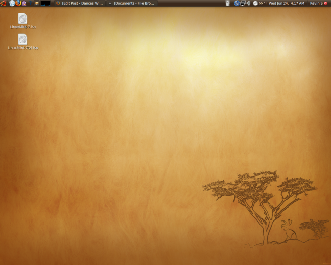
Two of the other themes, Bamboo Zen and Aquadreams, look like they would make good themes for Linux Mint if I ever get around to messing around with the new version (Linux Mint 7 Gloria).

15
May
09

New Theme

I haven’t played around with desktop themes since upgrading to Jaunty, but the other day, I found one that triggered the itch to experiment. It’s a vaguely Mac-flavored dark theme called Squaredoid-Black. However, this theme doesn’t come with window controls (GNOME’s name for toolbar colors, apparently). So I ended up downloading BlackWinter again in order to get darker toolbars. The next step was to find another dark wallpaper, since the old BlackWinter wallpaper was deleted when I did my Jaunty install. I ended up with something called Aurora, which looks like a rip-off of the default Mac OS desktop background. The resulting combination looks like this:

Desktop with Aurora Wallpaper

Desktop with Aurora Wallpaper

And here’s how the custom theme (which I’ve dubbed “SquareWinter”) looks in an actual window:

Picture Window in "SquareWinter"

Picture Window in "SquareWinter"

And it looks like, as any fan of Halloween will tell you, the orange of the default human icons mixes well with black.

12
Jan
09

Allegre

And I’m back to blogging about desktop themes again. I tried a new one called Allegre. It comes in two versions, all downloadable from the linked page. The version I used is called Allegre Ubuntu and is designed to look good with the default Human icon set. Here’s a screenshot:

Allegre Human

Allegre Human

I like the menu bar, window borders, and window controls (maximize, close, etc.), which are based on Dust. Overall, this theme looks like a just slightly cooler version of the default Human theme, without overwhelming you with orange. The bolded menu bar headings are also a nice touch.

06
Jan
09

Hydroxygen + Shiki-Human Semicompact

While I was messing around with themes, I decided to try out the hydroxygen icons (customized to go along with the Human color scheme) with a theme called Shiki-Human Semicompact.  I think it turned out pretty well:

shikicompacthydro

And I swear, one of these days I’ll blog about something besides themes and icons. In fact, with the start of a new quarter, I’ll probably be testing out OpenOffice’s ability to read Office 2007 files and ranting about the advantages of Linux compared to the Windows programs I’ll have to use for school.

03
Jan
09

New Icon Set: Human 02

In my continuing efforts to improve the appearance of my desktop, I ran across a set of icons called Human 02. Basically, it combines some Hydroxygen icons with icons that more resemble Ubuntu’s default Human theme. So you get orange Back and Forward arrows in Firefox, but with somewhat cooler effects than you see with the default icons. You can even customize some of the icons when you first install the set.

That said, the installation instructions are somewhat counterintuitive. The download is a Debian package. Normally, this is a very good thing, since the last couple of versions of Ubuntu have included a Debian package installer which allows pain-free installations without using the terminal or digging around in folders for instructions. The authors recommended installing this package from the terminal, though, claiming that you would be overwhelmed with customization instructions if you did it that way. So what happened when I typed their installation command into the terminal? It ran the Debian package, complete with the long list of customization questions. Now, this wasn’t entirely a bad thing, since it’s easier than digging out the customization instructions for Hydroxygen. However, it was unexpected and left me wondering what the point of not using the Debian installer was.

At the end of it all, it’s a pretty good icon set. My only problem is the overly large Ubuntu logo. It doesn’t look quite right. It seems stretched out somehow. This is made up for by the application icons, which are much more colorful than the equivalent Hydroxygen icons. Here’s a screenshot of the desktop with Firefox:

Gotchione With Human 02 Icons

Gotchione With Human 02 Icons

Edit: It looks like I misunderstood the installation instructions. Installing in the terminal is the only way to get the customization instructions; the Debian installer will just install with the default options. It makes sense now.

30
Dec
08

New Desktop Theme

I read the Gnome-Look RSS feed religiously to find various extensions and themes for the GNOME desktop. Lately I’ve been experimenting with a new desktop theme once every couple of weeks on average. So it was about time for me to pick another one. I stumbled across one with the unwieldy name Gotchione. I liked the look of the panels, so I downloaded it. I found that the dark panels look good with the wallpaper from the BlackWinter theme:

Gotchione with BlackWinter wallpaper

Gotchione with BlackWinter wallpaper

I also went through the trouble of downloading and installing the hydroxygen icon set used by the theme’s author. This required a lot of messing around with the terminal, especially to substitute the Ubuntu logo for the GNOME desktop logo at the top left of the screen. It took about three attempts for it to actually take. Furthermore, the installation instructions included commands to get rid of files that weren’t installed. It looks like the maintainers of the icon set didn’t bother to update their instructions between versions.

Anyway, here’s how the hydroxygen icons look in Firefox:

Firefox in Gotchione

Firefox in Gotchione

I’m not sure how I feel about the icons yet, though they don’t seem too offensive. Anyway, this ends today’s exercise in desktop narcissism.